This is one of a series of posts where I focus on visualisations and techniques that I like. I’ll look at a particular kind of visualisation that may be less familiar than tables, bar charts or line graphs, and work through some ways of making it using R.
What are barcode charts?
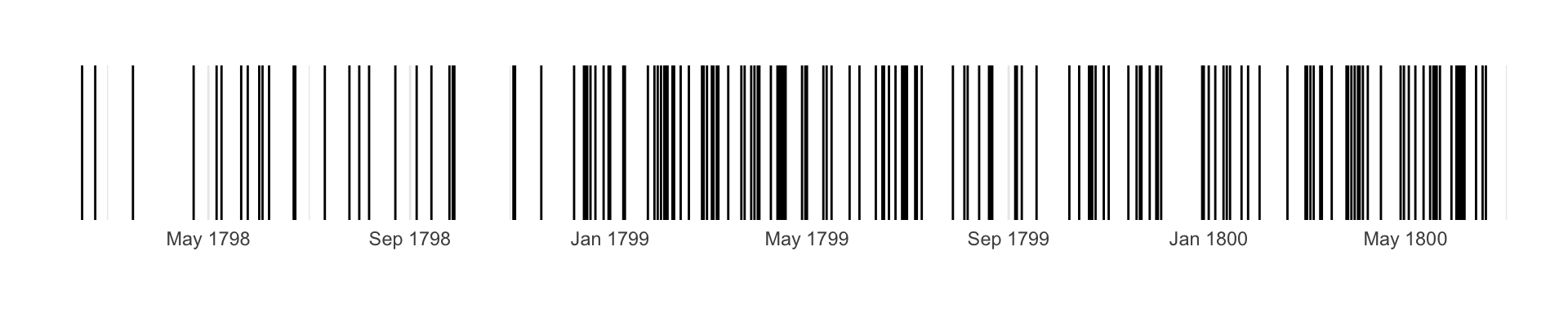
A barcode chart is a chart that looks like a barcode! When plotted horizontally, which is most common, it consists of short vertical bars, with each one representing a single data point, so it highlights clusters and gaps.
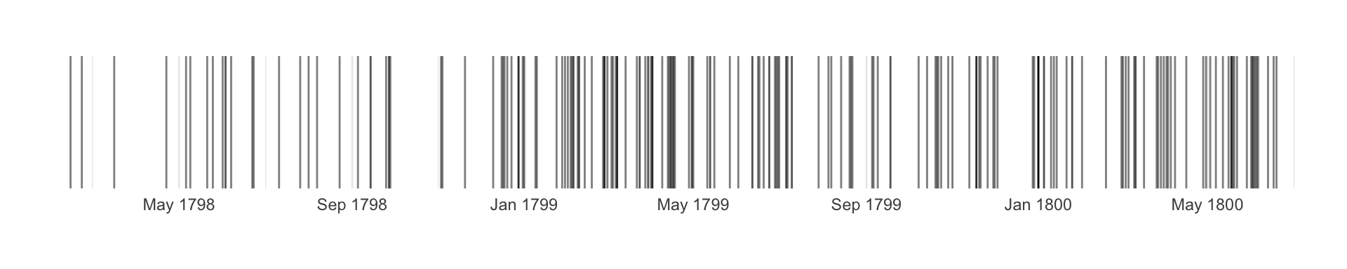
They’re a very compact way of showing quite a lot of data, and might be combined with density (especially if there are overlapping data points) or colour (making them like a kind of hybrid heatmap).
Prepare the data
This post uses two datasets:
quasi_war - Naval encounters during the Quasi War between France and the United States of America
sab_hp_injuries - 18th-19th-century hospital admissions data from the Skin and Bone project
(Show/hide code by clicking on ▼ above Code chunks.)
Code
library(scales) library(janitor) library(tidyverse)library(ggthemes)theme_set(theme_minimal()) library(mindseyedata)library(historydata)sab_ghs_admissions_grp <-sab_hp_injuries |>filter(description_dataset=="ghs") |># using injuries data, so need to deduplicate per descriptiondistinct(date_admission_std, description_id) |>filter(between(year(date_admission_std), 1825, 1829)) |>mutate(ad_grp =as.character(year(date_admission_std)))
ggplot
I’m focusing on using the chart to show chronological patterns, as getting dates into the right format can be a bit of a headache. They tend to be simpler when plotting numerical data.
single chart
This is using geom_vline(); geom_segment() works too but requires a bit more code.
It’s quite simple, but does need to explicitly use scales::scale_x_date(), and then play around with labels and date_breaks to get dates formatted nicey.
(Also note you want fig.height and fig.width options in the code chunk as well as aspect.ratio inside ggplot.)
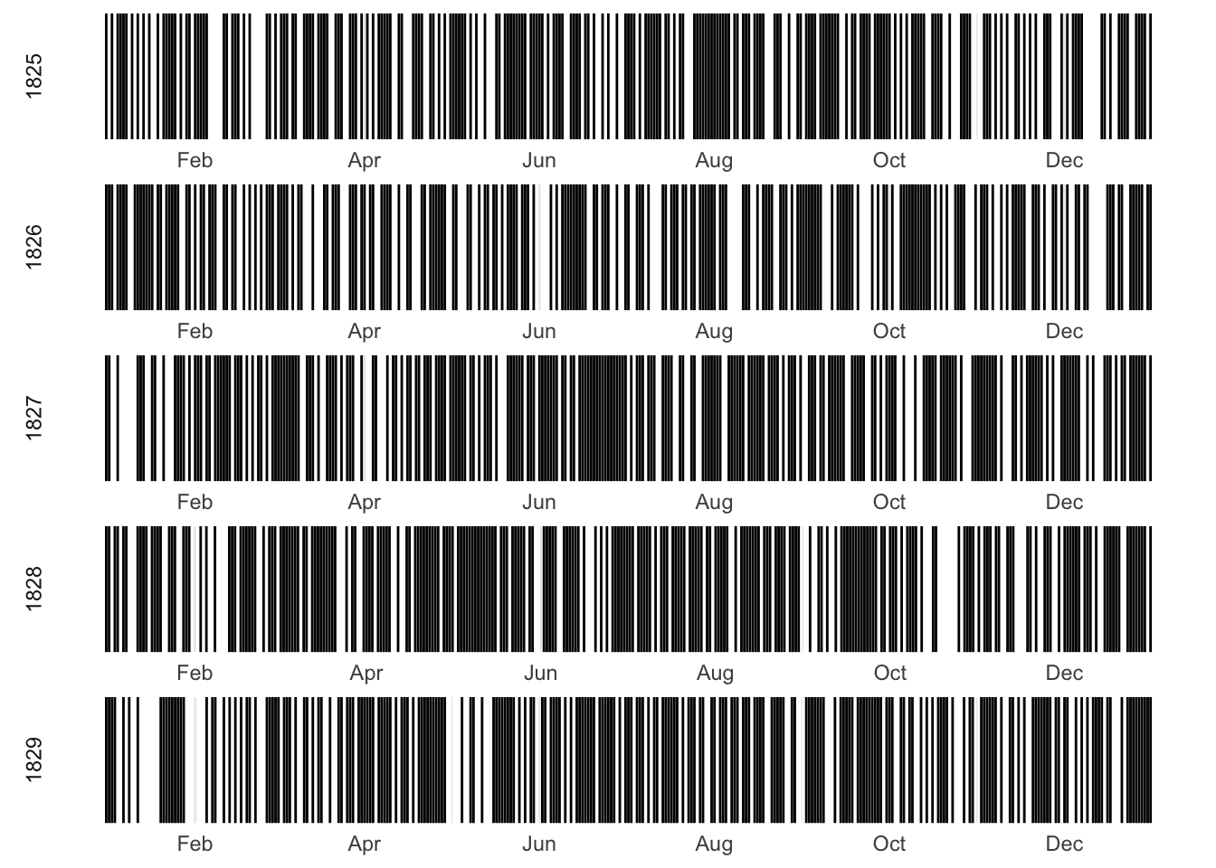
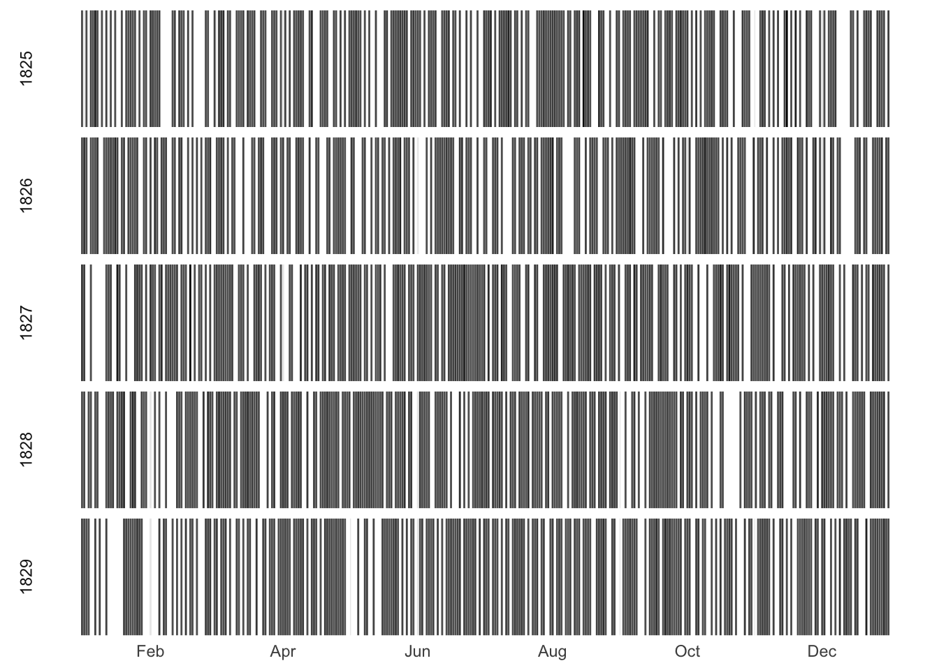
Then you can also use ggplot facets to compare groups, or look for seasonal patterns.
Code
sab_ghs_admissions_grp |>count(date_admission_std, ad_grp) |>ggplot(aes(x=date_admission_std, y=2)) +geom_vline(aes(xintercept = date_admission_std), show.legend = F ) +# month only on x axis, since year is in the facet label# default shows Jan-Jan idk why!# date_breaks gives Feb-Dec; better tho I'd prefer Jan-Decscale_x_date(labels =date_format("%b"), date_breaks ="2 month") +# scales=free is necessary here but...facet_wrap(~ad_grp, scales="free", ncol=1, strip.position="left") +theme_minimal()
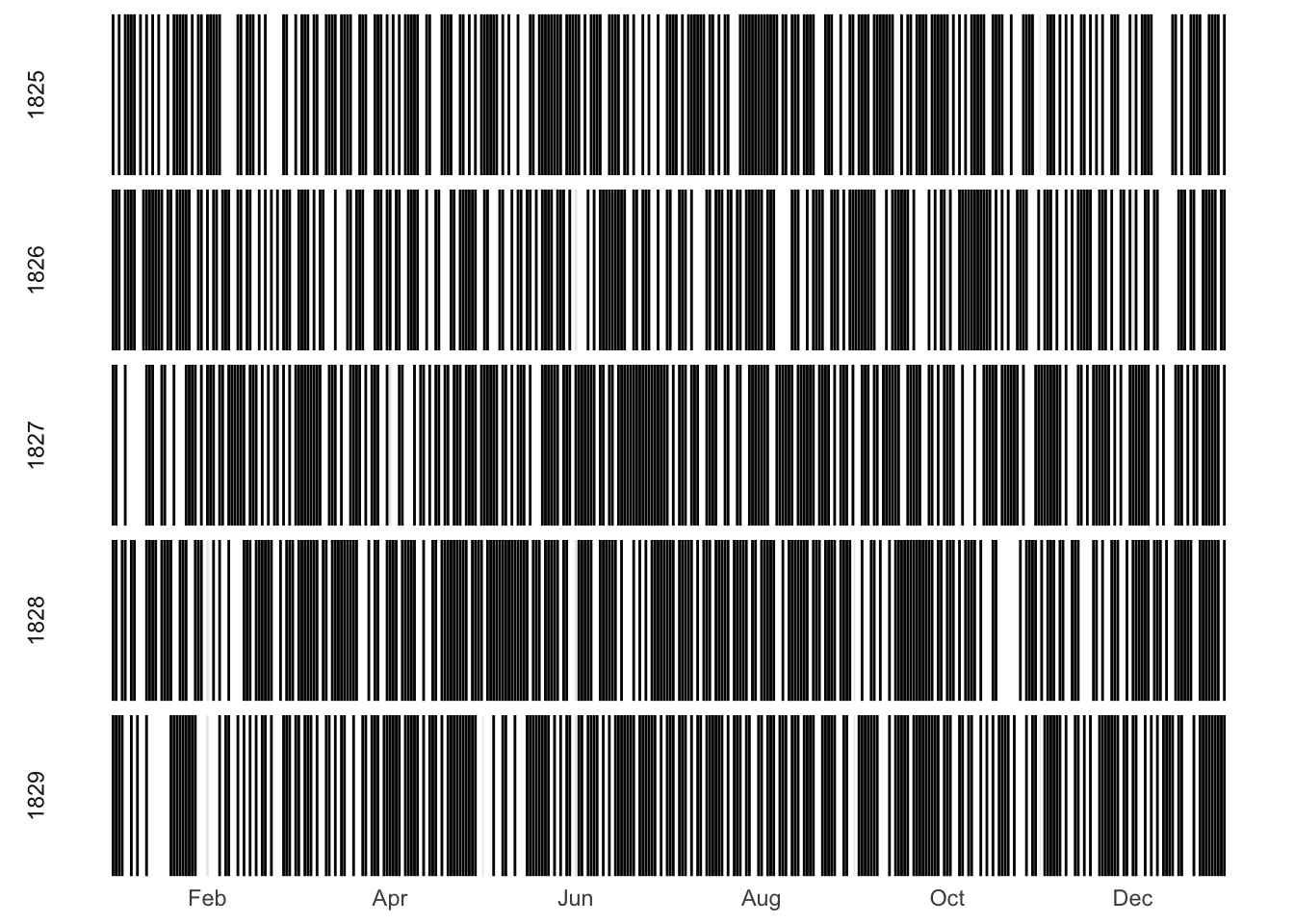
The chart above would be fine for a quick exploratory chart. But using scales=free in the faceting means the month labels are repeated for each facet, whereas I’d prefer them to appear only once at the bottom of the plot. The easiest way to make that happen seems to be to change the dates to use a fake year which is the same for all.
(NB in this case the fake year needs to be a leap year because there happens to be a 29th February in the data.)
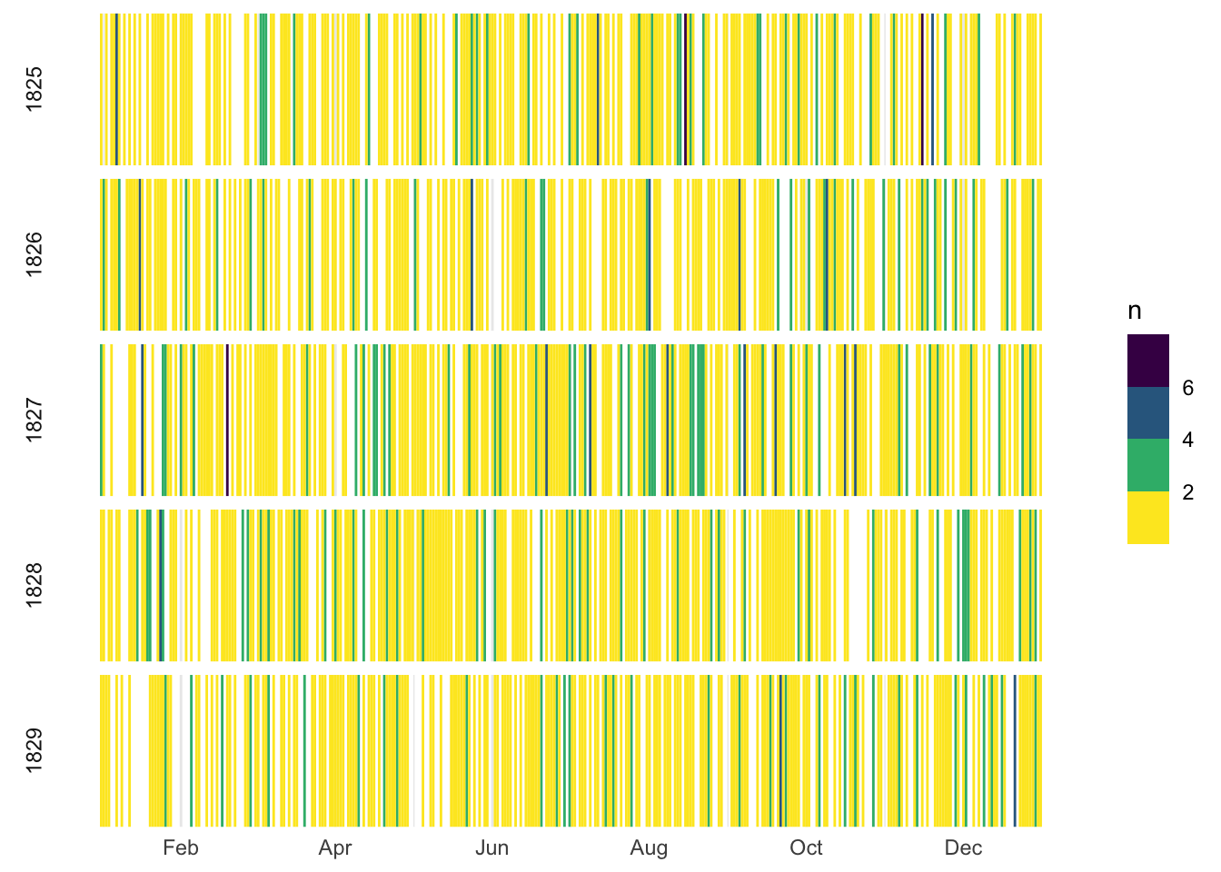
Colour works better for this one, I think, though I don’t know that there are enough days with more than 1 to make any real difference. (This starts to look more like a heatmap, but I’ve reversed the usual colouring so that lighter=fewer, because that feels more intuitive in this situation.)
If I import data into OJS from a file (using FileAttach), it should automatically recognise dates. But that doesn’t work with ojs_define(). So I need some extra code for the dates in order to get the plot to work.
Code
d3 =require("d3")// Define the expected date formatparseDate = d3.timeParse("%Y-%m-%d");ojsWarDates = ojsWar.map(d => ({newDate:parseDate(d.date),...d}));
But, after the initial date formatting some more work is needed on the dates in the chart.
After a lot of failed experiments and searching, I got the answers from this Observable Notebook. I’m not sure I would have worked it all out for myself, as there are several adjustments needed, and some javascript stretching my novice skills.
in the x axis labels, format date as month only
reformat the date inside the tick mark code (reset year and format as unixtime)