How to make stripped down mini charts to highlight trends
methods
OBO
Author
Sharon Howard
Published
1 June 2025
Introduction
This is the first of a series of posts where I focus on visualisations and techniques that I like. I’ll look at a particular kind of visualisation that may be less familiar than tables, bar charts or line graphs, and work through some ways of making it using R. They won’t involve much historical analysis, but it should also be an opportunity to introduce interesting historical datasets that I might not otherwise get round to posting about.
What are sparklines?
Sparklines are miniature visualisations with very minimal contextual info: features like axis labels and gridlines are usually stripped out. Sometimes you’ll see a single sparkline, but they’re often used in multiples, or embedded in tables.
Probably the most common use is to show and/or compare trends over time, and the most common form is (as the name suggests) the line chart, but other types of chart like bar charts are sometimes used.
(Code is shown by default since the focus is on methods, but if you’re not interested in that, you can hide it by clicking on ▼ above each code chunk.)
Get data
Code
library(snakecase)library(readr)library(dplyr)library(tidyr)library(ggplot2)# annual counts of offence categories (counted by trial)year_offence_category_csv <-read_csv(here::here("site_data/obo/year-offence_category-bytrial-20250531.csv"))# the data from the API is in wide format; make it long format for ggplotyear_offence_category_long <-year_offence_category_csv |>rename(year=key) |>select(-doc_count) |>pivot_longer(-year, names_to ="offence", values_to ="count") |># some filtering (early years are often incomplete)filter(between(year, 1720, 1899) & offence !="miscellaneous") |># make camelCase category names look better as labelsmutate(offence =to_snake_case(offence, sep_out =" "))
ggplot
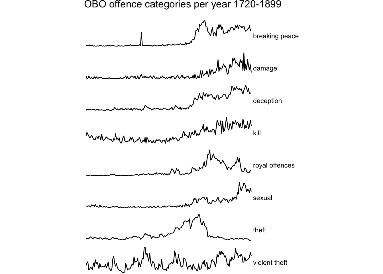
It’s pretty easy to make sparklines in ggplot2: make a faceted chart and then strip out all or most of the usual annotation. The examples here don’t have very many lines, but they can be scaled up to show dozens of categories at once.
The plot loses any sense of scale - and there are big differences, so that needs to be handled with care! - and it’s not possible to date with precision, but it facilitates comparison of long-term trends.
Code
year_offence_category_long |>ggplot(aes(year, count)) +geom_line() +# strip.position moves labels to rightfacet_wrap(~offence, ncol=1, scales="free", strip.position="right") +# expand to reduce/remove margin between the line and strip labelscale_x_continuous(expand =c(0,2)) +# theme_void is a blank theme - removes axis text, gridlines etc.theme_void() +# tweak positioning of labelstheme(strip.text.y =element_text(angle =0, vjust=0.4, hjust=0)) +# add a little space below plot title; default feels cramped. theme(plot.title =element_text(margin =margin(0,0,13,0))) +# a cheat to give more of a miniaturised effecttheme(aspect.ratio =1/6) +labs(title="OBO offence categories per year 1720-1899")
tweaking and extending ggplot
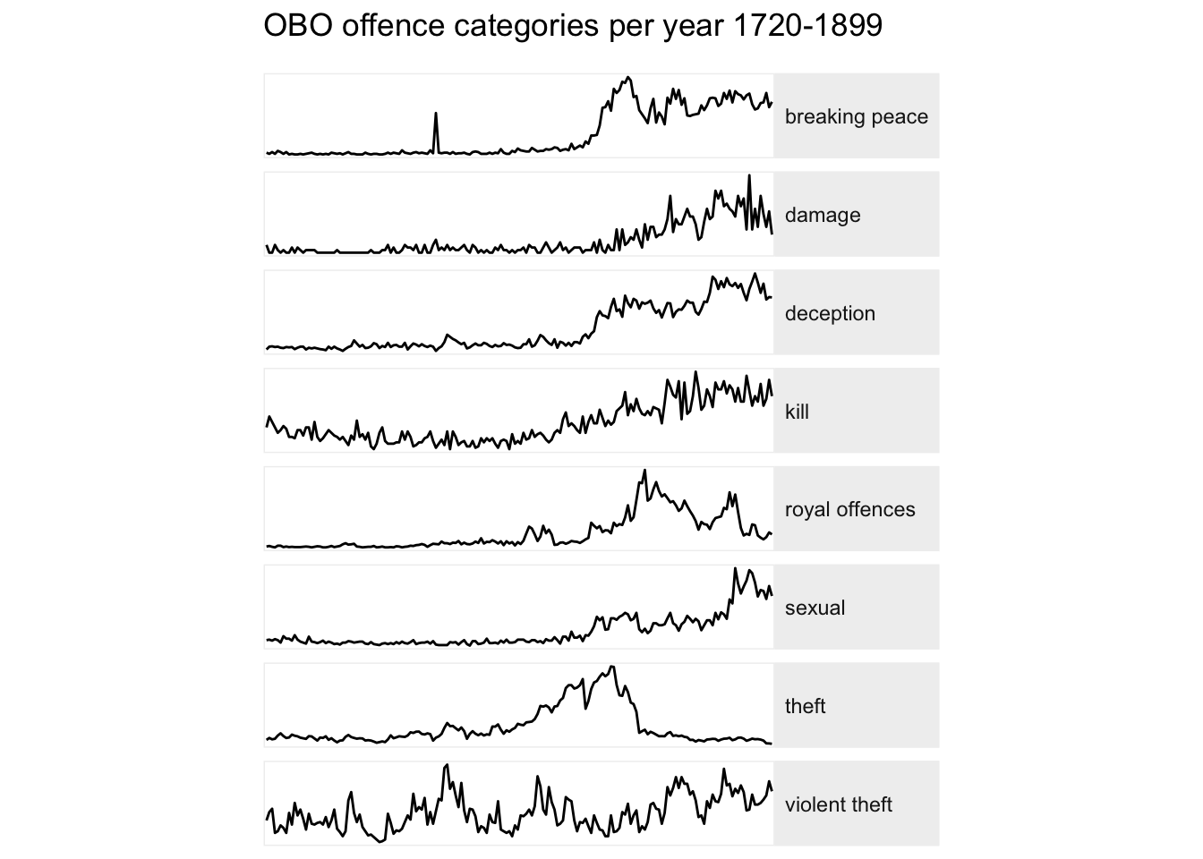
I can make some tweaks to the appearance of the plot using ggplot theme() functionality.
Code
year_offence_category_long |>ggplot(aes(year, count)) +geom_line() +facet_wrap(~offence, ncol=1, scales="free", strip.position="right") +scale_x_continuous(expand =c(0,1)) +# more selective removal of unwanted text, lines etc for more control# theme_minimal is a lightweight themetheme_minimal() +# remove text and title from both axestheme(axis.text =element_blank(),axis.title =element_blank() ) +# remove grid linestheme(panel.grid =element_blank()) +# remove tick marks.theme(axis.ticks =element_blank()) +# facets background (fill) / border (colour) # a light border gives a bit of definition.theme(panel.background =element_rect(colour ="#f0f0f0")) +# ditto for strip labels background/bordertheme(strip.background =element_rect(fill ="#f0f0f0", colour ="#f0f0f0")) +theme(strip.text.y =element_text(angle =0, vjust=0.5, hjust=0)) +theme(plot.title =element_text(margin =margin(0,0,13,0))) +theme(aspect.ratio =1/6) +labs(title="OBO offence categories per year 1720-1899")
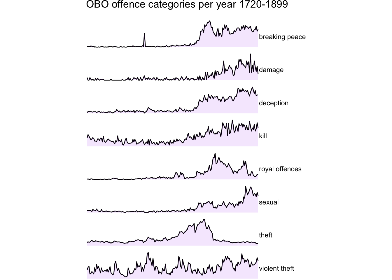
Another highlighting option is to add background to area beneath the line (with ggplot::geom_area()).
There are often ggplot extensions to streamline making popular visualisations but this doesn’t seem to be the case with sparklines. There is, however, a package called ggspark which adds some visual statistical enhancements.
Code
library(ggspark)
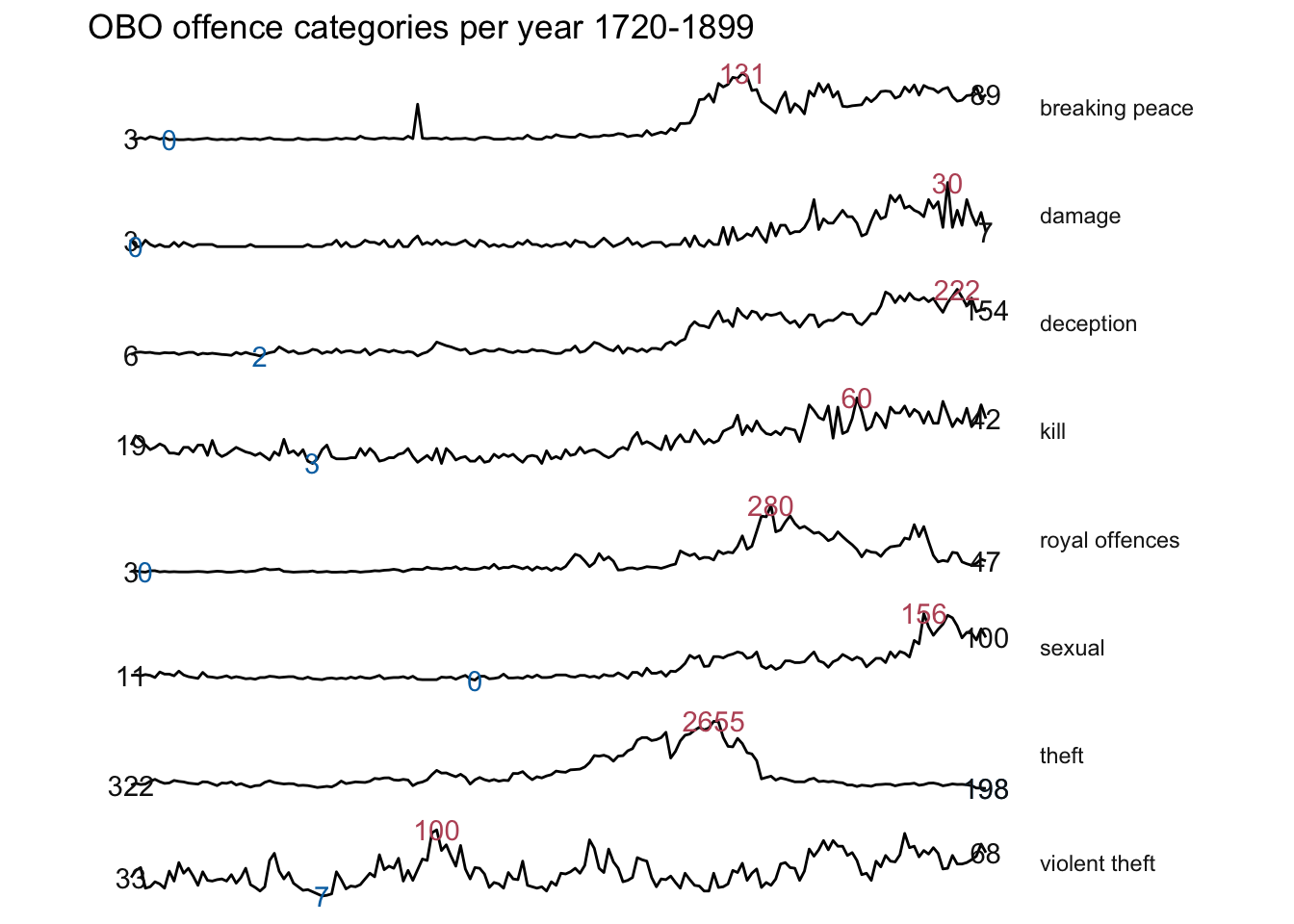
the package has two main functions: stat_interquartilerange() that draws a geom_ribbon() between the 1st and 3rd quartile of the variable in the y axis, and stat_sparklabels() that draws points or text labels in the beginning, min, max, and end points of the variable in the y axis.
I didn’t find the ribbon particularly illuminating so I’ve left it out, but the text labels reintroduce some useful context. But it’s a bit cluttered and would get worse with more categories. 0 is the min for most of the categories, so is it that useful anyway? It might be more helpful to have just the starting and max count for each line (I’m not sure how to use geom_text in facets, so that’ll be something to investigate.)
Code
year_offence_category_long |>ggplot(aes(year, count, group=offence)) +# stat_interquartilerange(geom = "ribbon",# show.legend = FALSE) +geom_line() +stat_sparklabels(geom ="text",show.legend =FALSE) +scale_colour_manual("", values =c("grey8", '#BB5566', "#0072B2" )) +# expand also stops the text from being clippedscale_y_continuous(expand =c(0.2,1)) +facet_grid(offence~., scales="free") +theme_minimal() +theme(strip.text.y =element_text(angle =0, vjust=0.5, hjust=0)) +theme(panel.grid =element_blank(),axis.ticks =element_blank(),axis.title =element_blank(),axis.text =element_blank()) +theme(aspect.ratio =1/10) +labs(title ="OBO offence categories per year 1720-1899")
reactable + sparkline
Another common use of sparklines is to have them embedded in a table. Here, I’ll use the more interactive options available with the reactable and sparkline packages.
This time the counts data needs to be summarised in a list column.
Code
year_offence_category_group <-year_offence_category_long |>group_by(offence) |># make absolutely sure they're in the right orderarrange(year, .by_group =TRUE) |>summarise(offence_count =list(count)) |>ungroup()
A nice feature with this is that the annual counts are in tooltips on hovering over the chart. But the defaults are not quite what I’m after…
However, like many R htmlwidgets packages, the underlying javascript library has loads of customisation options. I’m not wild about the format for the tooltips either, and there are probably options for those as well. But I’ll leave it at that for now.
Here’s a sparkline of theft cases and here’s one for killing in the text.
gt
The gt package offers an alternative, though I think it’s less customisable.
As with the reactable/sparkline version, the defaults are meh, and some twiddling is needed. I’m not sure if there are additional options for the sparkline function, and it doesn’t have tooltips.
Code
library(gt)library(gtExtras) # for the sparkline functionyear_offence_category_group |>gt() |>gt_plt_sparkline(offence_count, fig_dim =c(10,100), same_limit =FALSE, type ="shaded", label=FALSE) |>cols_label(offence_count ="annual trends 1720-1899") |>cols_width(offence ~px(150))