Useful and fun visualisation of part-to-whole relationships
methods
petitioning
Author
Sharon Howard
Published
20 June 2025
Introduction
This is one of a series of posts where I focus on visualisations and techniques that I like. I’ll look at a particular kind of visualisation that may be less familiar than tables, bar charts or line graphs, and work through some ways of making it using R. They won’t involve much historical analysis, but it should also be an opportunity to introduce interesting historical datasets that I might not otherwise get round to posting about.
What are waffle charts?
Waffle charts (aka “square pie charts”) represent categorical data via a grid of small squares forming a larger square or rectangle, which resembles a waffle. They are a useful and visually pleasing alternative to pie charts or stacked bar charts for showing how parts relate to the whole.
This post uses two datasets of early modern petitions:
Apprenticeship Disputes in the Lord Mayor’s Court of London 1573-1723 - 14271 cases brought to the Lord Mayor’s Court of the City of London by apprentices seeking the early termination of their apprenticeship indentures; includes information about apprentices, masters, the reasons for the dispute and the result of the case.
The Power of Petitioning - summary data for 2847 early modern English petitions, including information about archival sources, dates, petition topics, petitioners and administrative responses
(Code is shown by default since the focus is on methods, but if you’re not interested in that, you can hide it by clicking on ▼ above each code chunk.)
Get data
Code
library(scales) library(janitor) library(readxl)library(glue)library(tidyverse)library(ggthemes)theme_set(theme_minimal()) library(waffle)apprentices_xlsx <-read_excel(here::here("site_data/apprentices_disputes/apprenticeship_disputes.xlsx"), sheet ="Main index") |>clean_names("snake") apprentices <- apprentices_xlsx |>rename(year_binding=x21, year_petition=x27) |># minor cleaning, some inconsistencies in datamutate(across(c(year_binding, year_petition, result_of_the_proceedings, reason_for_the_petition), ~str_remove_all(., "x|z"))) |>mutate(across(c(year_binding, year_petition, result_of_the_proceedings, reason_for_the_petition), ~na_if(., ""))) |>mutate(result_of_the_proceedings =str_to_upper(result_of_the_proceedings)) |>mutate(reason_for_the_petition =case_when( reason_for_the_petition %in%c("e", "p") ~str_to_upper(reason_for_the_petition),.default = reason_for_the_petition )) |>mutate(across(c(year_binding, year_petition), parse_number)) |>mutate(reason =if_else(str_detect(reason_for_the_petition, "^U"), "U", reason_for_the_petition )) |>mutate(reason =case_match( reason,"B"~"Not bound correctly","C"~"Unreasonable chastisement","E"~"Non-enrollment","F"~"Master a foreigner","I"~"Instruction not provided","N"~"Necessaries not provided","P"~"Expelled from service","S"~"Not in business in the city", "U"~"Bound under the age of 14" )) |>mutate(result =case_match( result_of_the_proceedings,"A"~"agreement reached","D"~"apprentice discharged","N"~"no decision","W"~"jury decides for defendant" )) |># remove 2 and 3 digit year of binding which are probably errorsmutate(year_binding=if_else(year_binding<1500, NA, year_binding)) |>mutate(p_petition =case_when(is.na(year_petition) ~NA, year_petition<1650~"1569-1649", year_petition<1675~"1650-1674", year_petition<1700~"1675-1699",.default ="1700-1722" )) |>mutate(p_binding =case_when(is.na(year_binding) ~NA, year_binding<1650~"1573-1649", year_binding<1675~"1650-1674", year_binding<1700~"1675-1699",.default ="1700-1723" )) |>mutate(apprentice_years =if_else(str_detect(number_of_years_of_the_apprenticeship, "[0-9]"), number_of_years_of_the_apprenticeship,"")) |>mutate(apprentice_years =parse_number(apprentice_years)) |>select(id, number_of_petition, p_binding, p_petition, reason, result, apprentice_years) tpop_qs_petitions_xlsx <-read_excel(here::here("site_data/tpop/tpop_petitions_petitioners_v1_202208.xlsx"), sheet ="QS_petitions")cheshire_petitions <- tpop_qs_petitions_xlsx |>filter(county =="Cheshire") |>select(petition_id, county, year, topic, petition_type, petition_gender, response_cat, petitioner, reference) |>mutate(petition_type =str_remove(petition_type, " *on behalf"))
Making waffle charts
A popular and easy to use ggplot-based package is waffle, by Bob Rudis.
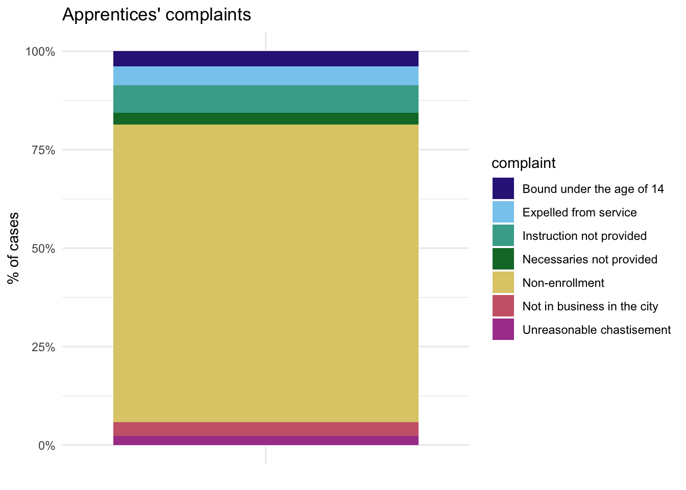
For comparison though, let’s start with a quick look at two more familiar types of chart that waffle charts are often used to replace, the stacked bar chart and pie chart (which is essentially a bar chart turned into a circle).
There is a difficulty with the apprentices data: one category (non-enrollment) is much larger than all the rest put together, which is not an uncommon experience with history data.
Code
apprentices |>count(reason) |># remove a few very small categories and NAsfilter(n>100) |>ggplot(aes("", n, fill=reason)) +geom_col(position ="fill") +scale_fill_ptol() +scale_y_continuous(labels =percent_format()) +labs(fill="complaint", y="% of cases", x=NULL, title ="Apprentices' complaints")
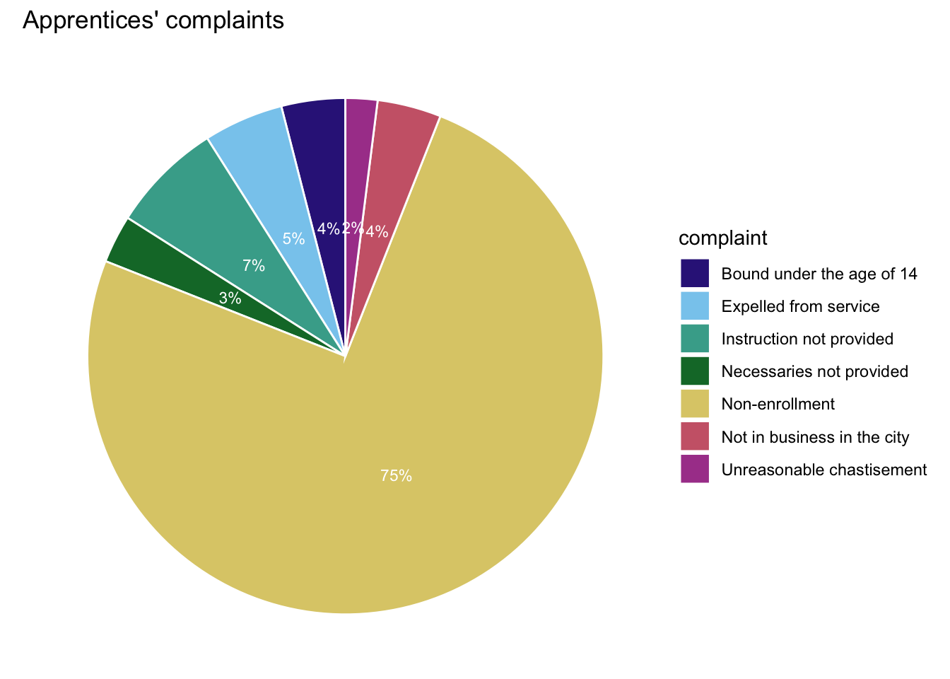
The pie chart is prettier but has the same problem; adding percentage labels to the pie helps. I’d generally only use pie charts for a smaller number of categories. (Based on code here.)
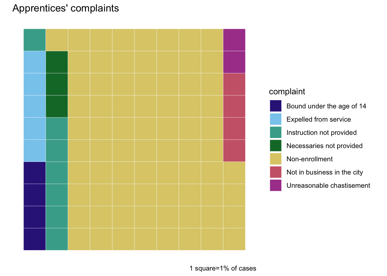
Now for the waffle chart, and the smaller categories are much easier to read (without needing to add text labels).
One thing that you do have to watch out for is that categories can get broken up over multiple rows (here, instruction not provided). Very tiny categories (less than 1%) are likely to be omitted entirely from the chart, though to be honest I think if they’re that small that’s probably the best thing to do with them anyway.
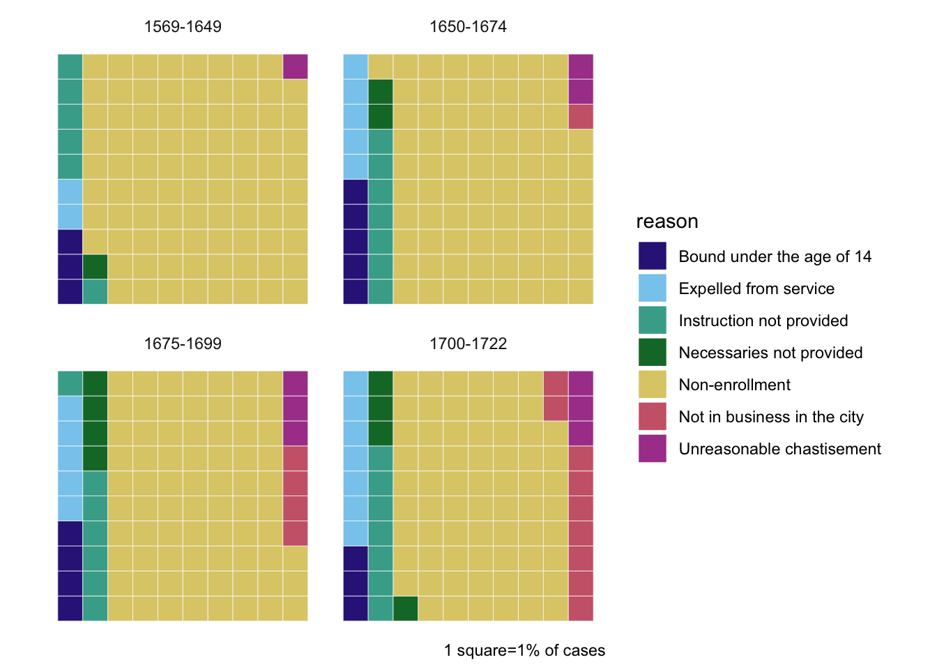
As the waffles are based on {ggplot}, it’s straightforward to incorporate faceting (aka small multiples or trellis charts) to add another variable to make comparisons.
Here, the apprentices data is split up into four time periods.
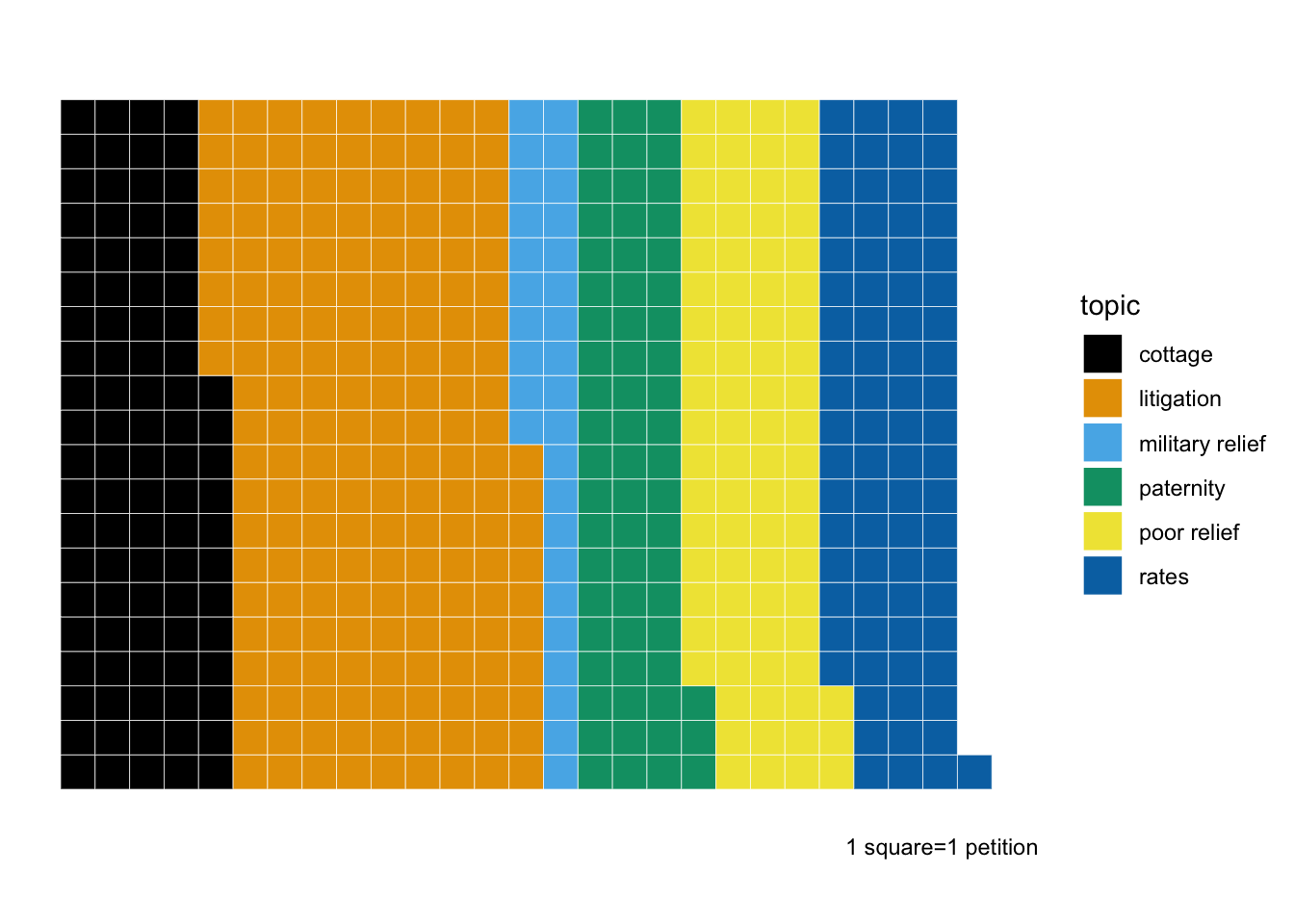
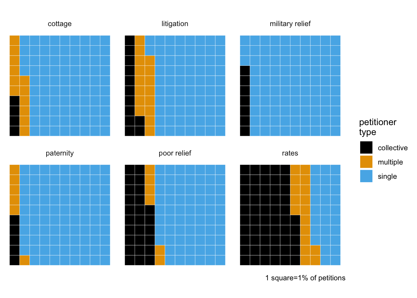
Breakdown of Cheshire petitions by topic and petitioner type (“collective” petitions are from groups like “the inhabitants of Runcorn” rather than named individuals).
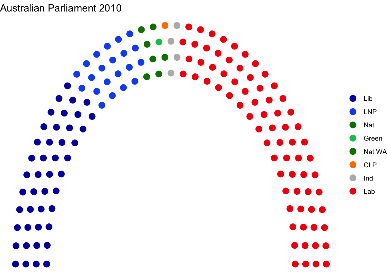
You’ve probably have seen a semi-circular version of a waffle chart used to visualise party representation in legislatures. There is an R package for making these (and other shapes), ggparliament.
This one’s the Australian House of Representatives in 2010.